
Oliver Arnott
Design Critique 2
Website Design 1
Mr. Christopher Harper
4-8-2026
Poor Design
Here is a link to this site.
Overall Design
Ranking: 2 out of 10
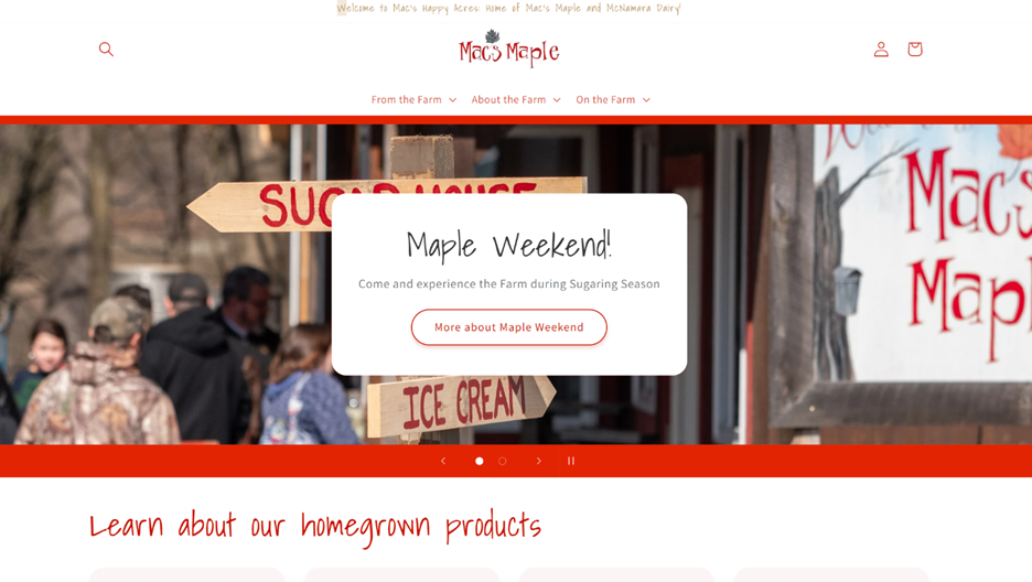
The overall design of this site is poor. First, although the links are in a clear spot at the top of the page, they open into a blank white bar that has many options and requires the visitor to dig for important information. Second, although the colors are maple related, they switch back and forth across the pages, eliminating consistency. Finally, the footer includes significantly important information, such as contact that should have a place on the header for ease of use.
Navigation
Ranking: 4 out of 10
The navigation is difficult to use. The links on the top have a clever format of being different aspects of the farm, but that eliminates their clearness. Having pages such as products, contact, and about are more helpful than a clever play on words. There is a search bar, which is helpful, but it is in a strange spot, just floating on the upper left corner. Finally, the massive amount of animation makes scrolling through the pages overwhelming. There are movies, affects, and animater pictures on most pages that made me want to leave the site quickly.
Functionality
Ranking: 4 out of 10
The site’s functionality is only mediocre at best. I believe their goal is to sell their different products, one of the main ones being maple syrup. However, the first bar of information on the front page after the picture is learning about the products, not buying! It is not immediately clear where to view all their products and how to purchase them. This is detrimental to the strength of the site. This site appears more helpful for learning about their products then purchasing them. Also, when I finally got to their maple products page, there was more information about their syrup first, and then a list of products. A clearer approach to products would help this site significantly.
Content Quality
Ranking: 3 out of 10
The content quality on this site was poor for a rather strange reason. This site is just to complex to complete its goals effectively. First, the extremely bright red and blue along with the extravagant use of animation makes it hard to understand. Second, the main font is hard to read. It has a unique outline that makes it look more like pencil writing then typing. I see that they are trying to make their site stand out with this, but I believe that it makes the site stand out in an obnoxious sort of way. Finaly, their call-to-action content is placed in such strange spots. The white block in the middle of the front picture is in a poor spot. It blocks the picture and makes me want to push it aside and see the content behind it.
Site Effectiveness
Ranking: 4 out of 10
Due to its poor quality, this site is not effective. It has images that may help draw the readers to a purchase, but it is hard to scrape through all the animation to get to their actual products. The contact page is buried, and few people will go through the effort to find it. This company looks like it has quality products, but if no one knows how to get them, they are not going to sell. I recommend a simplification and restructuring of this site to make it quality.
Excellent Design
Here is a link to this site.
Overall Design
Ranking: 9 out of 10
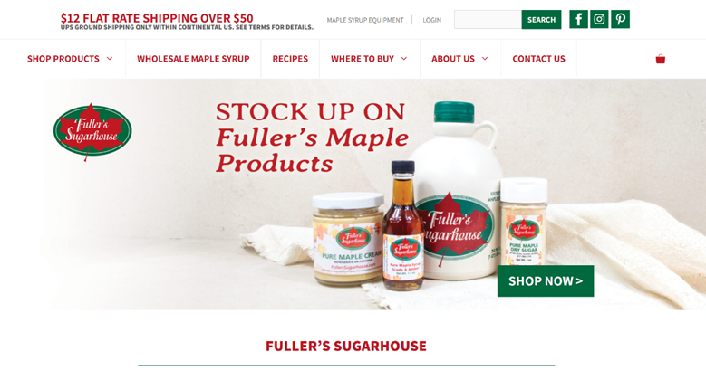
This website has an excellent design. First, it has a picture of its products on the first page, showing what they do and making it clear what their mission is. Their color scheme fits maple syrup well. There is red, which is the color of maple syrup, and green, which emphasizes that their products are nature based. Their links are clear for all to see, right on the top of the page. There are several ways to navigate the site, and nothing is hard to find. Their site has a professional, yet old fashioned feel that supports the historical product, maple syrup.
Navigation
Ranking: 9 out of 10
Their navigation is great. First, the links are easy to see and lead to helpful submenus. I found it particularly strong that the links are simple, and do not include unneeded information. There is also a search bar at the top, so that the customer can search for exactly what they need. At the bottom of the page, there is a box that lists more links, which leads the customer to delve deeper into the site. The site quietly leads the viewer to make a purchase by having various links that navigate them to buy from their business.
Functionality
Ranking: 9 out of 10
The functionality is also professionally done. A customer coming to the site would immediately be struck by the pictures of their products, and that will start the process of drawing them into making a purchase. All the pages can also act in a singular way, so that a user coming to that page without seeing the homepage will have no trouble figuring out the mission statement and knowing how to complete their goals.
Content Quality
Ranking: 10 out of 10
This site has powerful content quality. It contains well designed pictures, informational sections, and a large amount of product pictures and variety. The writing is helpful, and not extensively long and boring. Most importantly, the website does not require the user to read a bunch of instructions on how to buy their product. If the user wants to learn more, they can do that through the about and recipe pages. Everything about this site’s content that I viewed helped me learn more about syrup, wile making me want to buy their products.
Site Effectiveness
Ranking: 10 out of 10
This site is effective. First, the ease of finding out how and where to buy from them significantly increases the chance of someone doing just that. Second, the blog page has fun family activities that help draw in customers and other visitors. Third, the recipe page is a great idea because it gives fun ideas that need syrup, and this site provides that with ease. Finally, all the call-to-action links, such as “Buy Now” are placed in helpful spots, and they take the visitor directly to the products.